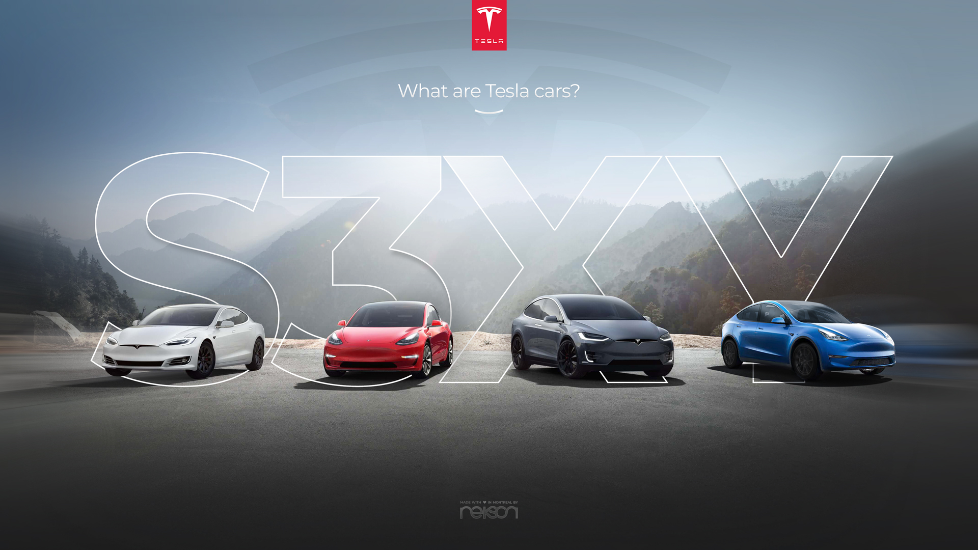
We made a new webdesign of Tesla’s website

At Nekson we are driven by creativity, passion and efficiency.
When we arrived on the Tesla website, we realized that the Model Y was not on the homepage webdesign.
So we had no other option then feeling like we had to do something about it.

Because, as stated in the beginning of this blog post, we love efficiency, the original concept was already great, this why instead of redesigning everything we made the choice of simply add what was missing.
The solution in that case was to simply do some photo editing and add the missing model Y.

So we designed what could be the new Tesla website and we made a video about it!

Source : https://youtu.be/JGFCUH78EEg

Many people in the comment section of Youtube loved or new Tesla website webdesign and requested our creation to use as the wallpaper of their computer screens.
We made a promise to them that we would share it with them!
So here they are (click on the size that you want, save the picture and enjoy ?)

3840 x 2160 pixels (4K):
1920 x 1080 pixels (Full HD):

We posted this Youtube video online on September 14th, 2019 and just a week after we already had over 2000 views.
This is incredible for us! We are really proud that people are interested in seeing the backstage of how those kind of webdesign projects are made.

If you are among the people that enjoy this webdesign or seeing how we create our digital design projects, don’t forget to subscribe to our newsletter just below.
We promise to keep your surprised and amazed with our amazing upcoming designs!

You like our Tesla Webdesign?
Stay in touch & subscribe to our newsletter:

Curious to see more?

Check out our work

3 mistakes to avoid when creating your website

Why spend thousands of dollars on an agency to do your website, when you can do it by yourself?!
Sure they are educated designers with years of experience but how hard can it be? Well, you are just about to find out!
In this blog post we will tell you about the mistakes to avoid when creating a website.

Here are the most common mistakes small businesses make when designing their website

#1 Simple introduction

Have you ever arrived on a website and thought “What was it, that I was looking for?”

Websites can easily become extremely confusing with too much text, weird pictures, or too many colors, it can make it hard to understand what the business is about.

Therefore, introducing  your business in a simple way is very important, it’s the same when you meet new people face-to-face, and the first thing you say is

HI, I love shopping for shoes, I have been shopping for shoes since I was 15 when I got my first job…do you want to see how long I can hold my breath?

The thing is if your visitor doesn’t understand your business in the first 5 seconds when they arrive on your website, they will most likely leave and go to the next.

Instead, you need to make the first page simple and clear with only the most important information.
Therefore you can always go in more nerdy details on your “About” page. (You need to have an “About” page, no excuse!)

Read why “About” page is important by clicking here

How to Get Your Website on the First Page of Google?”

Swami
#2 CTA (Call to action)

They arrive on your website but what should they do now? Should they come to your shop, should they call you or can they buy the product here?

“Call to action” means that you make it clear what you want your visitor to do when they arrive on your website, it can be a button, that makes your visitor do an action.

Rather then letting them find what they should do by themselves.

Above all, if you want your visitor to become a lead, you need to be clear in the action you want them to take.

Want to know more about CTA? Click here

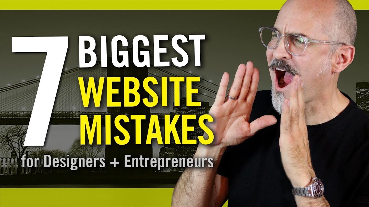
Take a look at Philip VanDusen’s video about the mistakes to avoid when creating a website

We certainly recommend even more, by going to his channel and get more yummy knowledge by watching Philip VanDusen’s videos

#3 SEO (Search Engine Optimisation)

SEO is one of the biggest reason why you have visitors on your website, because it will give your website traffic! 

Therefore, you absolutely need to make sure you do the SEO correctly, it is very important part of a successful website!

Try to google something! You’ll notice that there are billions of websites, for that reason, how do you make sure that people sees your website?

First of all, your website needs to be on the first page on Google! 

Why? Because, when people google, they want to find what they are looking for, fast Ask yourself, do you ever go to page 17? even page 2?

You can have the best product and excellent design however, statistics prove that almost nobody click after the 3rd result, and as a result, you are not being seen by your potential clients.

Click here to know more about SEO

Conclusion

First of all, it isn’t just about cool design, it is much more!

Most importantly, it is hard work to make a successful website if it’s your first tine. (However, it is not impossible either.)

Consequently, you should try to look at some of your favourite websites and ask yourself “Why do I like this website?” that is a great help for inspiration.

Click here to read about or digital service in Montreal

We want to hear about your experience!

How did you make your website? Was it an agency or you did it yourself?

Let us know why you took that decision in the comments below

Did you learn something in that blog post?
Stay in touch & subscribe to our newsletter:

What makes a good business logo

There are a lot of great logos, but sometimes, very important pieces are missing before it’s a successful logo.

Think of a pizza! Have you ever tasted a pizza and felt like something was missing? You couldn’t really point your finger at a specific part but all you could think was “This pizza isn’t that great” but why?

Think of a logo, just the first that comes to mind….what logo did you think of? You might have thought of something like Coca Cola, Amazon or McDonald’s, do you know why?

What do they all have in common? What makes their logo so famous?

After reading this blog you will know the secrets you need, to create a successful logo.

Simple

A good logo needs to be easy to recognise with a simple design and the design needs to symbolize the brand’s messages.

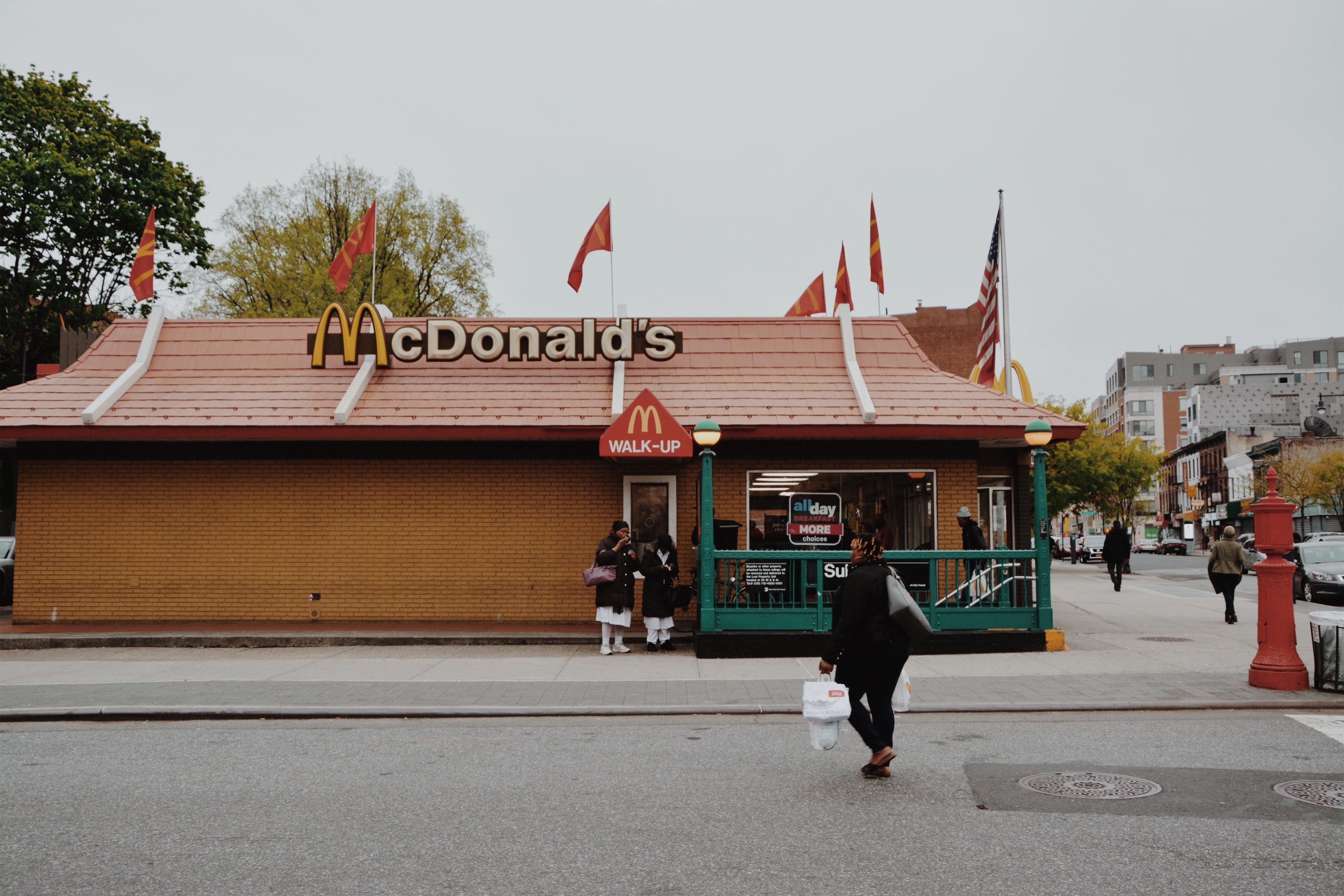
Here is an example “McDonald’s” “M” it’s simple, the shape is the symbol of the arches
that were part of the design of the building of the first restaurant in 1952.

It’s unique, because they managed to keep the shape of the logo, from the first restaurant,
that is pretty amazing, don’t you think?

When your logo is simple, the brain recognizes it instantly and the logo can be processed faster by the human eye, as a result your clients will remember you and return.

That is why the logo is often called “The face of the company”

Do you agree with that?


Meaning of your logo

Let’s stay with the McDonald’s logo since it’s a logo we all know well. What does it represent? It’s just an “M” it doesn’t represent very much, or does it?

You won’t find many logos with a simple meaning, you can always go deeper (if it’s a great
logo, of course.) and you can keep analysing them.

So, back to the “M”, it’s the first letter of McDonald’s and that was Patrick*s last name. He
opened the first drive-through back in 1937. Did you notice that the shape also looks like two fries bent into an “M”? Did I make you hungry?

Okay…Let’s quickly talk about the Nike logo (also known as the Swoosh.) it is of course super simple but still, it has so much positive energy, it almost looks as if the logo
is moving!

You can feel the motion and the speed, and it’s all created by the shape of the logo, therefore it’s perfect for a sports logo.

The Nike logo is a good example on a very simple yet successful logo. Don’t spend too
much time being abstract with your design if it has no point in the messages you want to give.

The color

The color of McDonald’s logo is yellow and red, do you know why?

If your answer is “because red and yellow is super nice colors!” then please look around you, find a chair and then hit yourself in the head with it, till you say “Sorry!”

(I’m just kidding!)

You will never get a call from your designer saying “Okay, I just need to add some colors, what is your favourite?” you must always think deeper when it comes to design.

How can you find a color that represents the/your business?

E.g. red and yellow together has a psychological effect on us. When we see it our heart rate
increases, it makes us happy and we instantly think of food.

If that isn’t fascinating, then I do not know what is! We could, of course, go deeper into details as color is a huge topic in design and has tons of meanings

check out this article about color psychology in logo design & branding.

However, it is important, that a good logo looks great in black/white as well.

If your logo has color (most logos do.) look at it in black/white and see if it’s as amazing.

The logo should give old as well as new clients emotions and instincts from the different colors, but it shouldn’t dominate the design.

Conclusion

If we go back to the beginning and imagine the logo as a Pizza. You now understand that it
isn’t enough to make it beautiful. You cannot serve the pizza with amazing crust only.

You must make sure the mozzarella is great, the tomatoes have the right color and the
pizza has the correct shape.

To make a successful pizza, make it unique, otherwise, what is the point of eating your pizza?

Your clients will not remember your pizza for the crust if that’s the only thing that was
amazing.

Your pizza, well…logo, is the image of your business, so make it amazing!

What is your favourite logo?

Did you learn something in that blog post?
Stay in touch & subscribe to our newsletter:

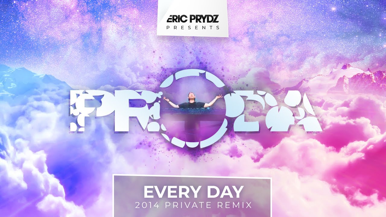
After so many requests, 5 years later we are releasing Eric Prydz Every Day Remix Wallpaper!

Five years ago we heard to amazing remix of Every Day by Eric Prydz and we had to share it with the rest of the world!
We are big fans of Eric’s music! And when we say big fans, we mean it 🙂
Our CEO, Yacine, have been inspired by Eric’s music for almost as long as he has been a designer, therefore when he received a picture of Eric from another fan he directly knew what to do!

Don’t you think he looks like Jesus with that pose?!”

Few hours later the picture was designed, the video was edited, ready to be uploaded to youtube.
Check the music in case you don’t know it yet you can watch it on youtube or directly here :

Five years, 45 comments and 84 880 views later we are astonish!
We didn’t expect to have such an amazing positive return on our picture. People were requesting to share the wallpaper with them. It is now the case!

Download the Eric Prydz Wallpaper:

Simply click on the one you want, right click on the picture to save it and enjoy!

You like our Eric Prydz Wallpaper?
Stay in touch & subscribe to our newsletter:

About

We are independent creative agency based in Montreal and proud to be.
We are specialized in giving life to ideas and landing them into the real world.


Google Reviews
Benjamin DenisBenjamin Denis
13:25 10 Jun 21
The Nekson agency redid our corporate website and we were very satisfied with the work and their professionalism.
Marie-Ève DumontMarie-Ève Dumont
12:49 01 Jun 20
Excellent work. He understood the needs of our organization and advised us adequately. The work was also completed quickly. I highly recommend it.
kristina DAMIENkristina DAMIEN
16:15 10 Feb 20
I used the services of NEKSON to create a logo for my fashion brand: Mallow'lita.They were able to understand and meet my needs while providing their advice and know-how.Now that I have my logo in hand, I should soon order a website from them for even more results....I really recommend this digital agency.
Kévin PagèsKévin Pagès
19:17 13 Apr 19
We were looking for a digital design agency in Montreal that could help us make our website. We found them on Google and their portfolio (especially the project named Quoloc) convinced us that they were the right team to work with!We love our website and how great the team was during the whole process, always listening and advising. Great experts!
Amélie LegrandAmélie Legrand
02:45 20 Mar 19
I am delighted with the work done by this agency. Beautiful design work, listening to my needs and the result is there. I start again !
Abdoul DialloAbdoul Diallo
05:32 31 Dec 18
I worked with this agency for a logo and the only problem I had was to be able to chose the right concept for me in all the great concepts they presented to me! But they were also very helpful on advising so I can only recommend them. Will work with them again in the near future!
quentin bessequentin besse
18:25 25 Dec 18
I worked with Nekson to create a brand new logo for my company.They understood what we were looking for and came up with a final logo in just two weeks and now we can focus 100% on our business and we feel surrounded by an expert design and marketing team with Nekson.
Mélanie ClosMélanie Clos
18:06 25 Dec 18
Nekson is a great team to work with. I 100% recommend them!They are professional, very creative and always alert to their clients needs. Thank you for your work!
Jannie Slott HøjJannie Slott Høj
23:54 23 Dec 18
A very professional and effective team with great ideas and inputs
js_loader
Privacy Settings
We use cookies to enhance your experience while using our website. If you are using our Services via a browser you can restrict, block or remove cookies through your web browser settings. We also use content and scripts from third parties that may use tracking technologies. You can selectively provide your consent below to allow such third party embeds. For complete information about the cookies we use, data we collect and how we process them, please check our Privacy Policy
Youtube
Consent to display content from - Youtube
Vimeo
Consent to display content from - Vimeo
Google Maps
Consent to display content from - Google